Tuesday, April 17, 2007

Post-module thoughts...

Overall I think this module is on the right track. I find the approaches that we took since early in this module very helpful in trying to set up some kind of a framework to help designers evoke the desired emotions out of whatever product they are designing. The theories on design models such as emotional probes and Jordan’s four pleasure analyses really served as useful framework on user behavior, and the early assignments served as a good exercise to think about some of the ways in which values and pleasure were perceived. For one it actually helped me understand, as a user, on why certain design appeals to me or what kind of values I am deriving out of any particular product. Still, I felt that these frameworks rely very much our interpretation of what our target user would be like, and therefore vulnerable to overgeneralization and misinterpretation. Particularly on the four analysis assignment, I found it hard to design a product benefit specifications based on purely the need analysis without taking into consideration other factors such as taste, aesthetics preference etc.

The ethnographical approach also was a bit limiting in terms of how we could derive useful design ideas, because first of all, all the bits of pieces of information coming from all over the place are hard to quantify, and secondly, we’re making too many assumptions about the conditions in which people operate certain activities. For instance, in our improving learning experience for lecture theatres, it was difficult to gauge what really makes up a good learning experience and whether the technology (in this case, the Lecture theatres) was a great factor which determines that experience.

Some of the lessons from marketing and branding that were covered also helped us understand how they influence the user’s perception of products. Although, I feel that in practice, when it comes to designing products, it is very hard to take into consideration things such as branding because again, branding is a value system which is based on what the stakeholders (or what Christopher Fahey’s article mentioned as the ‘bosses’,) say what it is, which makes it hard to try to map it to what the user might perceive about the product concerned.

For our final project, we sort of tried to put some of the theories and frameworks into practice when we’re designing the product specifications, and I think we managed to get quite a round up specifications based on our user research. We didn’t realize how big of a project our product ended up to be, therefore although the tools that we employed during the iterative design process such as the card sorting, information architecture and prototyping were very helpful to put things into perspective, at the end, because of the limited time, we really didn’t have the chance to properly iterate the design process and we kind of closed off incoming design ideas due to the feature creep that we experienced out of the feedback from all the usability testing that we conducted. In fact I would say towards the end, the focus kind of shift into getting the usability right and kind of neglecting the other emotional user experience part of it. I guess this is how it is in the real world, but perhaps in the future, the final project should be initiated earlier so that students have time to reiterate the design process while still leave some time to think about the greater issue of user experience.

I think this module is tacking one of the most difficult issues out there, which is trying to define what experience is, and how to design it. The issue is that we’re not dealing with hard sciences where everything is measurable, but rather something more subjective and unquantifiable such as pleasure and other emotions. But overall, this module provided me with very good groundings and exposure over the issues of UX while giving me opportunity to experience the challenging process of designing UX.

Monday, April 02, 2007

Final Project Phase 4


The above slides encapsulates some of the paper prototyping that we did.

Sunday, April 01, 2007

Reflections on article:User Research Smoke & Mirrors (Christopher Fahey, 2006)

The article highlighted a couple of very important issues pertaining to the design process of experiential products such as websites or other interactive products.

The first is of course the tendency of designers making “scientific” user research the very foundation of their design process. The example on the use of eye tracking as a design tool is a classic example of trying to derive something empirical out of the experience of browsing a website. By measuring where users’ eyes were pointing for the longest time during a page-view, the hope is that an analysis of the subjective experience can be derived and such can be used as a design guideline. I guess the problem with such approach is that you are trying to measure experience by very narrow parameters such as user’s eye focus point, and neglecting other possible parameters which constitute the overall visual pleasure. For instance, just like what we went through in NM2208, things such as color, typology, layout and visual flow equally determine the psychology of perception, cognition and visual aesthetics, and they are not always necessarily measurable by simple empirical experimentations. Furthermore, these things tend to be personal and subjective and like any other behavioral research, very hard to quantify.

The other issue is of course dealing with the political aspect of any product development, as design strategies are often influenced by stakeholders, peers, and bosses who have their own agendas, priorities and biases. But I guess I very much agree that sometimes empirical or objective user research data is used as a sort of “bargaining tool”, in the sense that it helps explain and justify good design decisions to people without deep design skills or instincts — or to talk them out of bad design decisions. The designers need something to justify their creative design, while the ‘bosses’ so they called, often do not appreciate design opinions unless driven by research results, and I think this is an issue that can only be reconciled by a lot of compromise between the designers and stakeholders involved.

The article also stresses out the point that some less-rigorous methodologies and techniques are extremely helpful to the user experience designer; Card sorting, focus groups, guerilla usability testing, and user personas (even the ad hoc kind) can provide invaluable insights and useful tools for a design team, even as they are entirely subjective and even a little touchy-feely in nature. But sometimes they are the only valid ways of addressing the open-ended “wicked” problems such as "user Experience" design. As one comments in the article said, the designer’s art is to work with problems that cannot be tamed and come up with contingent solutions that work for one context at one time. User research for user experience should delve into the qualitative aspects of design to understand how and why people respond to what has been created, and, more importantly, how to apply that insight to future work.


Tuesday, March 27, 2007

Final Project Phase 3

Our presentation for phase 3 actually covers some areas from the previous phases, particularly on the part of Requirements Specifications.
Need Analysis finalization

We developed 9 personas, and we managed to derive the following needs to be fulfilled by our target user.
  • A simple, easy to use interface to get all info
  • Accessibility of the information
  • Manipulability (freedom to construct any kind of knowledge with the Data)
  • Usability (Functional)
Content
For the content of our product, we further investigated a list of feature requirements, based on the interviews and survey:
What the School Provides
Student's Requirements
Module Name and Description
Categorization into Course Requirements
Each Semester's Schedule & Exam Time
Time Table Builder, Scheduler, Bidding Management
Graduation Requirements
Graduation Requirement Tracking, Modules taken Listing
Structure of Assessments
Grade Simulator, Current CAP or Accumulative point
Announcements
Messaging tools (Email, Forums)


Card Sorting and Information Architecture

Experience Strategy

Design Element
What The personas Say
Possible Design Strategy
Visual (Sensorial Design)
icon sleek, clean, aesthetically pleasing
Functional, simplicity
Visual (Sensorial Design)
Intuitive interface, minimal instructions
icons with simple action words
[ie Track/Check, Forecast]
Information Architecture
no information overload; no cram functions
Use words, links and graphics only when necessary, avoid clutter
Interaction Design
Personalization
icons to create their own individual space;
customised user space
Interaction Design
Fluidity
employ a drag and drop interface.


Saturday, March 03, 2007

Final Project Phase 1& 2

A short summary of our Project Proposal:

Our Proposal
: To build a personal Knowledge management system aimed for students at a higher learning institute.

Our Target user:
Students.

What do they do:
In Plain terms, they want to achieve. Nobody would spend all the trouble to go through the formal education system without a high sense of goal setting and achievement seeking. Although the original intention of higher education is for Knowledge development and enrichment, the attractiveness of having prestigious qualifications for the purpose of career development outweighs any other objectives. Even if that sometimes involves bending some rules and work around with the system or play with the system.

How does it matter? In order to achieve, the students will utilize all tools available to help them attain their goals. Sometimes what the (school) system provide them is not sufficient or can be counterproductive, and in our case, NUS does not seem to provide an integrated system for students to manage their subjects/ modules according to the conditions for graduation. Furthermore a quick survey of the students reveal they have unpleasant experiences with the disintegrated systems which NUS provides.

Monday, February 26, 2007

Improving learning experience in Lecture Theatres

Presentation Slides:


Reflections:

For this assignment, we understood "Lecture Theaters" as a technological element of the larger teaching/learning system.
A "lecture" is essentially a form of passive learning (single directional information flow from the speaker to audience), therefore we felt that it is very important for the other non-teaching related elements to support the delivery of the content, which makes up the overall system of teaching and learning.
In other words, a lecture can happen anywhere, you can have a group of students sitting down on the school lawn surrounding the teacher in the middle, and it's still a lecture session, but the learning experience will definitely be different.

Hence the Lecture Theater itself is, in a sense, a tool, whose function is to help a better delivery of lecture content to the larger audience.

Generally for the system to work well, all the elements must work together according to their functions, therefore for our investigation, we are assuming that the Lecturer and the Lecture Content are both good, and thus not a contributing factor for learning experience. We instead investigate other elements which influence the delivery/ receiving of lecture content, such as:

  • Audio & Visual
  • Chairs
  • Temperature
  • Lighting
  • Other students

The framework we used to analyze Lecture Theaters as technology map the various elements to the four Emotional Threads: Compositional, Emotional, Spatio-Temporal, Sensual

We then formulate our research to find out what really determines the enjoyment of learning in lecture theatres.

Our initial assumption is that both Compositional and Sensual emotional threads increase enjoyment in attending lectures. To explore this, we employed two methodologies, Laddering and Survey.

Reflections from Laddering

Although we specifically wanted to find out about the Lecture Theaters, we purposely framed the question to be a general view about learning experience in NUS Lecture Theaters.

From a random sample of students whom we managed to interview, we found that neither of them talked specifically about the Lecture Theater, but rather talked about things like how they enjoyed going to lectures with their friends or how comfortable the lecture sessions are for playing games.

We found that to “ladder” them to find the root cause of the phenomenon do not land us in the kind of answer that we are looking for, therefore we decided Laddering may not be the appropriate methodology for such an investigation.


Reflections from Survey

We decided that a more favorable way to derive any useful insights from the students is through survey, which we did through an online site, and we managed to get 25 valuable responses from a random sample of NUS students.

Our focus of the survey is to find out what makes up a good lecture theater, so the very first set of questions straight away asked them:

  1. What is your most favorite Lecture Theaters (LT) and why?
  2. What is your lest favorite LT and why?

What we found is a striking candidate for most favorite and least favorite LT.

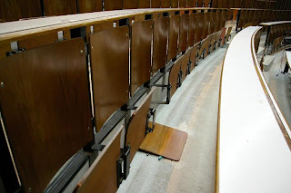
LT 11 seems to be the winner while LT 26 seems to be the most problematic. From their responses as for why they chose these LTs, both LTs seem to be completely opposite of each other in terms of Chair& Table comfort level, Room design & feel, room odor and room brightness level. LT 11 also seemed to be appraised for its new & spacious design and the number of power points for laptops.

LTs like LT26 hardly appeals anyone. Crammed seats, uncomfortable chairs, sometimes broken ones, funny room odor, very old look& feel, I wonder how students so far have put up with it...

New Contemporary design and spacious seating. Comfortable chair& fold-able writing arm. LTs like LT11 are hit amongst our generation of students.

Our other set of questions probed the four Emotional Threads:

Compositional

We asked them about how the chairs, the tables, the projector screen size and the sound system are, and we found most of them do not have problems with these compositional elements. However those who voted for LT26 being the worst LT all stated that the chairs and tables were poor and uncomfortable.

Spatio-Temporal

We asked them about the preferred seating position, such as which row/ section do they tend to sit, and their preferred lecture time. Most seem to like the Middle Front row/ Center combination and lectures are preferably in the morning.

Sensual
We asked them about their opinion regarding the temperature, the brightness and noise level in LT. Most seem to think that the temperature is a bit too cold and room brightness tends to be dark.

Emotional

We asked what they think the importance of LT as tool for learning is, and interestingly, most seem to feel that the LT itself is not the most important aspect of the learning experience.

We also asked the following questions to sort of get an idea of the effectiveness of learning experience in LT:

  • Do you ask questions? – Most answered No or sometimes
  • Do you sleep? – Most answered Rarely
  • Do you talk? – Most answered between Sometimes and often
  • How often do you arrive late for lecture? – Most answered Sometimes
  • Do you sms during lectures? - Most answered between Sometimes and often
  • Do you use laptop? – Most answered Never or Rarely

Conclusion

Although 25 respondents is hardly enough to derive something that we could generalize, we do manage to find some useful insights regarding which LT is favorable and not, and what makes them so. It seems that the Chairs design is the most determining factor, while other factors such as overall interior design and feel of the LT seem to influence the respondents' opinions. Other environmental factors such as room temperature and air odor also is worth taking a note at.

Despite that, we were also surprised to find out that the LT itself does not seem to be an important factor for learning experience, and perhaps this is where we feel further probe is required to investigate whether indeed other Factors do influence the overall learning experience in Lecture Theaters.

Sunday, January 28, 2007

Reverse Market Analysis for target user of: Designer Hand Bag


Perhaps out of the many other fashion items, women hand bags reflect directly the kind of status and personality of the carrier. The expensive price tags of some of the designer hand bags are a sign of achievement, especially amongst high profile career women who always strive for better success. The following description exemplifies such a profile:

Alice, a 26 years old sales executive living in Singapore.

She has been working in a relatively successful Software house for the past three years; first real job since leaving university, where she obtained credit pass degree in Business Information Systems.

She is very hard working and wants to earn as much money as soon as possible. As a Business graduate in a software company, she lacks the technical knowledge to promote the features of the products; however her strong work ethics, her charm and hospitality has brought her many favors from her employer as well as potential clients.

She is very fashion conscious, not only because it makes her feel confident, but her job requires her to be presentable when offering deals to potential clients. She is attractive and she takes care of her diet well to avoid unhealthy lifestyle, however she does not have time to exercise.

Alice is currently single, having just broken up with her university sweetheart. Alice is an independent girl who does not like the feeling of clinging to a particular person during most of her free time. Alice spends most weekends with her girlfriends for coffee and at night, she goes clubbing/ partying with her friends. She is a relatively introvert girl who would not start a conversation unless initiated by someone showing interest in her, but once start talking she couldn’t seem to stop. She also likes to go shopping and hunt for bargains, and she always look for the cheapest deal available. However, she is not shy to spend lavishly on items which she felt can help her exert her confidence and esteem.

Alice lives alone in her studio condominium and she keeps a lot of pets. She has a hamster and a puppy whom she enjoys taking care of. Her parents live overseas due to work commitments and her siblings are still studying at local universities. She calls her siblings once a week and assists them in whatever way they need. She also helps her parents to support her siblings’ tuition fees.

Alice is quite religious and never fails to attend her weekly religious service. She is also involved in her weekly religious community activities, where she enjoys sharing her personal thoughts and reflections.

Four-pleasure analysis

1.Physio- pleasure

  • Her job requires her to be presentable so she needs to keep in shape – need pleasure
  • Keeping a healthy diet keeps her fit – Need pleasure
  • When she goes out for coffee, she often indulges herself with cakes and ice creams – Appreciation pleasure

2.Socio-pleasure

  • To fill in the void of having broken up with her boyfriend, Alice enjoys spending time with her friends/ religious group – need pleasure
  • Alice prefers to have people approaching her so she effectively uses her charm and classy appeals to attract people's attention– appreciation pleasure

3.Psycho – pleasure

  • Perhaps due to her financial needs, she enjoys the feeling of getting the best savings out of the best deals- need pleasure
  • She likes nurturing and takes care of her pets well – appreciation pleasure

4.Ideo-pleasure

  • She likes her freedom in order to be actively involved in group activities– need pleasure
  • She is a very filial daughter and takes pride in helping her parents pay her sibling’s tuition – appreciation pleasure

Physio

Socio

Psycho

Ideo

Keeping fit and attractive

Attention from people

Financial relief

Independent

Healthy Eating

Friendship with a lot of people

Nurturing

Family Responsibility

Indulgence


Product benefit specifications

  • Fashionable design to exert independence, high self esteem and taste (Ideo- Independence, and Socio- Need for attention)
  • Personal organizer which includes food diary, complete with calorie monitoring system(Physio- need to keep fit) and also financial organizer to keep track of personal savings (Psycho - financial relief)
  • Automated Contact List sorter based on person most contacted or special people. (Socio - pleasure for friendship)
  • Snap-a-Contact: Special camera mode to take photo of a newly acquired contact and associate it/ prompt to enter a contact number (Socio - pleasure for friendship)
  • A pet-nurturing interactive mini game for quick entertainment (Psycho - pleasure for nurturing)
Reference Design: